Since late January, my ‘making’ hours have been mostly focused on learning to draw and design on paper. This semester I am taking Fashion Art & Design I at FIT in order to better articulate my ideas by hand and to learn how to create a portfolio should I decide to apply to the school (an outside chance but you never know!). My art background is limited to 2 2-hour drawing sessions in the ’90s and elementary school so I’m pretty much starting from scratch. Still, two months in and I’ve learned a lot.
We have drawn many fashion poses (called ‘croquis’) and after merely 2 weeks were already rendering designs (using colored pencils, markers and paints to express fabrics)! The whole experience has been super intimidating (especially as there are folks who majored in art in college in this class) but the professor has encouraged us to just work on improving and not comparing – always a good reminder. Here is where I started out – some early figures and faces.


One month in, faces slowly getting better. This exercise was about showing we understood how to draw a collar and put clothing on the form with the correct (cylindrical perspective).
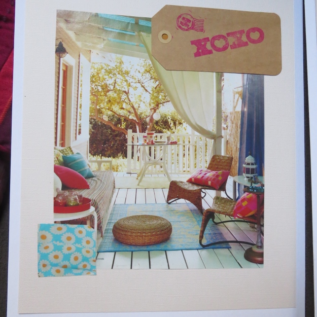
Last Thursday we turned in our first presentation. We were to make a mini-collection of resortwear at a low price point – think, Target, JC Penney, etc. The collection needed a unified color ‘story’ and we were also to base it on inspiration images we collected initially.
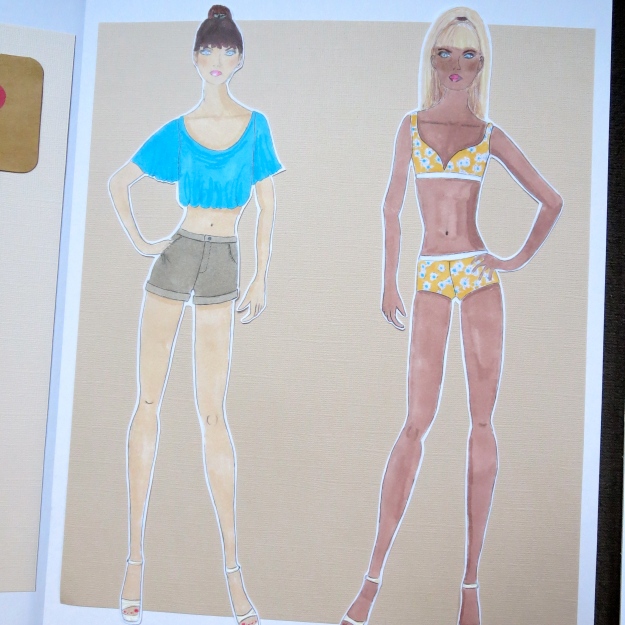
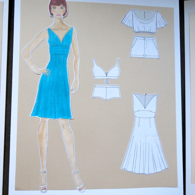

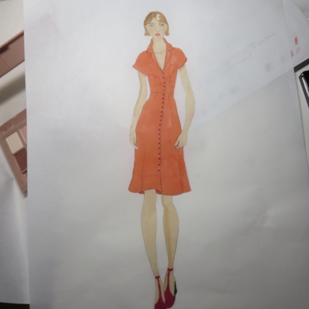
I found it hard to put together (only three designs?!) but I ultimately got it done. First I drew many small drawings of ideas and then narrowed it down to three. I drew many swatches of my print and eyelet fabric. My fabrics were tough to me but were much easier than some others’ (prints!). The Prof. was really great at showing us how to render our different fabrics, using various techniques/tricks of the trade. For instance, so my floral was not oversaturated, the marker is on the back of the paper which is thin enough to bleed through and then I redrew the flower outlines on the outside. My eyelet is using marker as well as several colored and graphite pencils. We were required only to do front view flats but despite doing many for Draping, they took forever. That said, she took one look at them and said they look great. A plus!
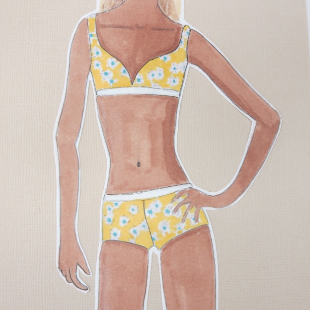
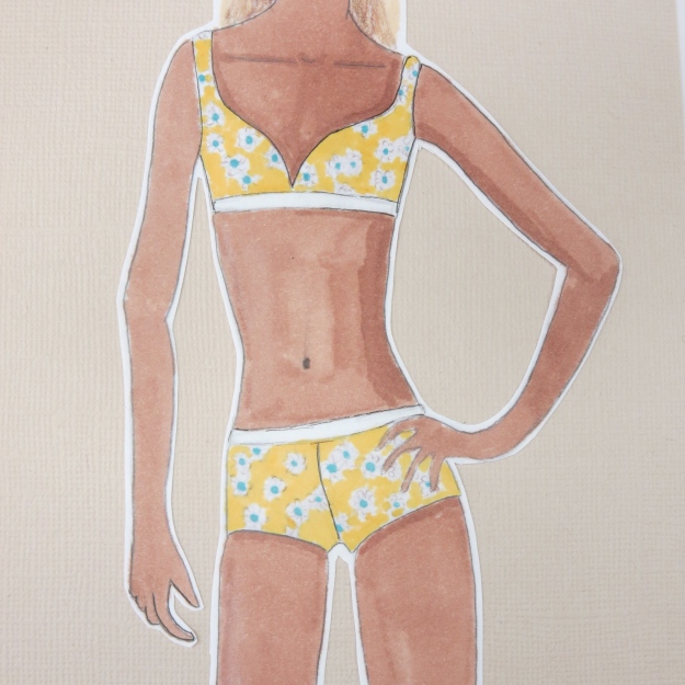
The fabrics are – upper left a white swim suit spandex and then a made up swim suit fabric using the same white as the base and the print from that cotton on top. To the right is a cotton eyelet; lower left is a blue silk knit and to the right a khaki cotton twill.
Overall, my designs are simple but I stuck to the assignment. That said, many others complete blew off the price point (which bugged me off b/c the prof didn’t seem to mind that people were turning in $200 dresses for Target – really?) but those students’ stuff looked much more intricate and cooler. I am hopeful I don’t get marked down for simplicity when I was keeping the market in mind (if I do, I will actually address this with her). Some other students did jaw-droppingly gorgeous work. Like wow! I am definitely in the lower quality work-product student group but for two months, I am really pleased with my improvement (other than swimsuit girl’s tanorexia – think I will skip that marker next time LOL).
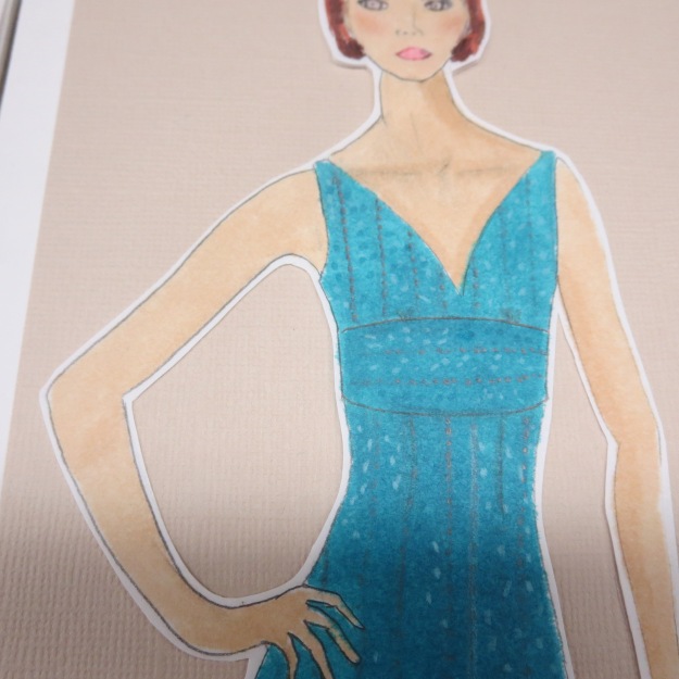
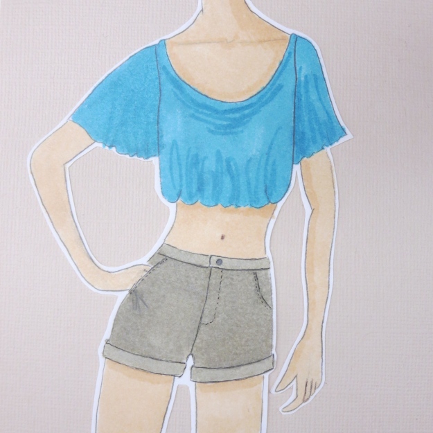
Some close ups:


Next up: A Chanel collection (our final project) – daytime dress, evening dress, suit (of course!) and outdoor coat. Chanel opens the door to luxury details and fabrics. Fun!
ETA: I got an A!
